8 Tips to Improve Your Sites Accessibility
I am a Sr. Frontend Engineer, Team Lead, with 10+ years of experience. I have experience building scalable, accessible, and responsive web applications. I enjoy writing about frontend development and hope to help you on your dev journey.
There are many different techniques and rules to building an accessible website and it might feel overwhelming. However, we want to make sure we build it in such a way that is usable for everyone. Below are a few tips that you can start implementing today that can improve the accessibility of your site:
- Heading Structure
- Alt Attribute
- Descriptive text for links
- Form Labels
- Table Captions
- Scope Attribute
- Visible Focus
- Tabindex
- Conclusion
1. Heading Structure
It is important to provide the correct heading structure as your headings outline the content of your site. Assertive technologies, browser plugins, and other tools can provide ways for users to navigate your site based on headers.
<h1>Heading 1</h1>
    <h2>Heading 2</h2>
        <h3>Heading 3</h3>
            <h4>Heading 4</h4>
                <h5>Heading 5</h5>
                    <h6>Heading 6</h6>
2. Alt Attribute
When using images on your site you should always provide the alt attribute. The alt attribute is used to the describe the image. This allows assertive technologies to read the description to the user. You might be asking yourself "What if I want to use an image for icons or presentational purposes?". In this case you should still add the alt attribute but leave the value empty. This lets assertive technologies know it's safe to ignore the image.
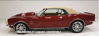
For example, let's say we want to display the below image on our site and we want assertive technologies to be able to read the description to the user.

The HTML for the above image would look like:
<img src="1968-chevrolet-camaro-convertible.png" alt="1968 Red Chevrolet Camaro Convertible" />
3. Descriptive text for links
Using descriptive text for your links allows users to distinguish the different links on the site and helps them determine if they want to follow the link. This is vital for users using a screen reader. They can navigate your site using the tab key and rely on the content to help them understand what they are viewing. The descriptive text helps determine if they should proceed to click the link.
Don't do
<a href="#">Click here</a>
Do
<a href="#">1968 Chevrolet Camaro Convertible</a>
You do not need to include the word "link" in your text because the screen reader will announce to the user they are on a link.
4. Form Labels
Form labels provide context as to what the form input is requiring. There are two ways to associate a label with a form element: explicitly or implicitly (see below for examples). The form label also provides a larger clickable area to access the form element. When you click the form label it will automatically set focus to the associated element.
Explicitly
Explicitly means the for attribute on the label matches the id attribute of the form element.
<label for="first-name">First Name</label>
<input id="first-name" type="text" value="Rocco" />
Implicitly
Implicitly means you wrap the form element within the label element.
<label>
    First Name
    <input id="first-name" type="text" value="Rocco" />
</label>
I recommend using the explicit approach according to WAI. It generally has better screen reader support.
5. Table Captions
A caption acts as a title of a table. It's useful for a user using a screen reader. If the user is in table mode they primarily use the caption to identify tables. This allows for better navigation and data association. I recommend adding captions to all tables to ensure the best possible experience for all users. If you don't want the caption displayed you can use CSS to display the element off-screen.
<table>
    <caption>Company Information</caption>
    <thead>
        <tr>
            <th scope="col">Name</th>
            <th scope="col">Symbol</th>
            <th scope="col">Price</th>
        </tr>
    </thead>
    <tbody>
        <tr>
            <th scope="row">Microsoft Corporation</th>
            <td>MSFT</td>
            <td>$218.29</td>
        </tr>
    </tbody>
</table>
6. Scope Attribute
The scope attribute is used by screen readers to associate data cells with corresponding header cells. Screen readers will do their best to guess which to use. The default value of scope is col. I recommend being explicit to avoid guessing.
<table>
    <caption>User Information</caption>
    <thead>
        <tr>
            <th scope="col">Name</th>
            <th scope="col">Age</th>
        </tr>
    </thead>
    <tbody>
        <tr>
            <th scope="row">Rocco Sangellino</th>
            <td>36</td>
        </tr>
    </tbody>
</table>
7. Visible Focus
Visible focus helps a keyboard user know which actionable element has focus. The browser has a default style but these tend to be removed in css resets or if styles are undesirable. You are able to add your own style to match the design of your site. The benefit of providing a focus style is it provides aid to a keyboard user operating your site. The important piece is to at least add some type of style to a focus state to ensure the best possible experience for all users.
<button type="submit">Submit</button>
/* default Chrome style */
:focus {
    outline: -webkit-focus-ring-color auto 1px;
}

/* Custom CSS */
button:focus {
  outline: none;
  border: 2px solid red;
  color: blue;
}
8. Tabindex
Tabindex is used to manage keyboard focus. There are three types of uses: tabindex="-1", tabindex="0", tabindex="1" (or any number greater than 1). Lets break down what each of these mean below:
tabindex="-1"- removes the element from the default navigation flow. Meaning you will not be able to tab to the element using the keyboard, but you will be able to programmatically set focus. Most of the time these are used on non-interactive elements such as: div, span, or paragraph. This can be useful when a modal is opened and you want to set focus to it or if you are in a form and want to set focus to an error message.
<div class="modal-dialog" tabindex="-1">
    <div class="sr-only">Start of modal</div>
    <h2 class="modal-header">Header</h2>
    <div class="modal-body">Modal Content</div>
    <div class="sr-only">End of modal</div>
</div>
document.querySelector('.modal-dialog').focus();
tabindex="0"- allows elements to receive keyboard focus without affecting the normal navigation flow. This is usually used on elements besides links and form elements as those already have keyboard navigation. This can be used if you are creating a custom element that is not normally focusable.
<div tabindex="0" role="button">I am now focusable via the keyboard.</div>
NOTE: If you use role="button" you will need to add enter and spacebar functionality as the div needs to fully act as a button.
tabindex="1"- manually setting the tabindex to something other than-1or '0' should be avoided. This will affected the normal navigation flow and could be confusing to the user and cause undesirable results. All elements that are tabbable will have a default tabindex based on their position in the DOM. Looking at the example below notice how no tabindex is set. The browser will first focus to thebuttonthen toaand finally to the lastbutton.
<button type="button">Will be focused first</button>
<a href="#">Will be focused second</a>
<button type="button">Will be focused third</button>
Conclusion
I provided a few tips that can be used to update your current site or if you are starting a new one. I encourage you to take the time and read up on web accessibility so all users can enjoy your site. Below are a few links to help you get started:


